The welcome page in Sonatype Nexus Repository is a hosted service that provides timely updates and resources to help with your work. It's integrated with Sonatype Nexus Repository out of the box, and is the first thing you see after logging into the UI.

Periodically, the welcome page checks for an update to its content and pulls it down if available. This allows us to provide you with the latest information, even if you're not on the latest version of Sonatype Nexus Repository.
You may have noticed that we've made frequent changes to this content over the last six months. Historically, the welcome page has been a rather overlooked part of the Sonatype Nexus Repository experience. Going forward, we plan to change this, with updated content delivered weekly, to provide you with the most useful and relevant information. If you have any feedback on how the welcome page could be improved, please fill out this survey.
The original design, as shown below, was definitely ready for a design overhaul.

We started by converting it to a responsive design, with a look and feel that's more consistent with the rest of the Sonatype Nexus Repository UI.

Next, we began to promote new versions of Sonatype Nexus Repository. This has turned out to be popular, with almost half of engagement going to the download link. Our treatment for Sonatype Nexus Repository 3.3.2 is shown below.

Next, we decided to measure the number of times each link is clicked. This will help us improve the experience by keeping content engaged with frequently and removing content that isn't.
Within a week, we saw the following distribution of clicks, and were able to formulate a plan for improving it.

We made a few changes (mentioned in the screenshot above).
-
Enhanced the "Component Usage Trends" image to better match the other banners.
-
Removed a number of links that weren't providing value.
-
Refreshed the banner image for the Sonatype Nexus Repository 3.4.0 release.
Our revised version of the welcome page is shown below. In the first week, we saw a 10% bump in engagement.

We had two hypotheses for this increase in engagement.
-
The 3.4.0 announcement
-
The simplified layout with fewer links
Two weeks after releasing this simplified layout, engagement is back to pre-experiment levels, making us believe that hypothesis #1 was responsible. The initial excitement around 3.4.0 has leveled off, resulting in a drop from those initial numbers.
It's still useful to note that engagement is exactly the same as before, even with half as many links on the page. This gives us confidence that those other links, while not preventing people from engaging with the page, weren't helping drive engagement either.
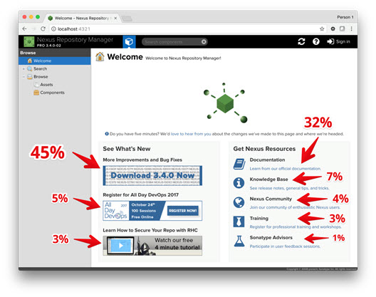
We've continued to make small tweaks to the page. The current treatment is as follows (with the engagement distribution highlighted as before).

The new icons in the "Get Nexus Resources" section seem to be driving more engagement, by counterbalanced with the visual weight of the banners on the left.
Going forward, we plan to augment the qualitative metrics shown above with a survey and user interviews led by Shade Solon, our Senior UX Researcher. We've put together a proposal for what the welcome page could become, and would love to get your feedback on it.
If you'd like to chat with us about this and any ideas you have for improving the welcome page, please fill out this survey and we'll be in touch.
We expect to continue shipping updates to the welcome page weekly. Expect to see more here soon, but please contact us at any time with your thoughts and ideas.
Tags

Try Nexus Repository Free Today
Sonatype Nexus Repository is the world’s most trusted artifact repository manager. Experience the difference and download Community Edition for free.
